Case Study
i2goX
All-in-one Insurance Management Platform
Product Designer
Murat Khamitov
Platform
Web
Date
March 2024
Duration
1 week
Overview
This exploration project presents an extensive SaaS insurance management solution called i2go made by tigerlab and it's designed to streamline the entire insurance lifecycle from quote and policy issuances to claims resolution. The platform offers a wide range set of tools and features to manage policy holder interactions, policies, and financial transactions seamlessly.
Define
Our platform is currently facing several challenges. It operates on a rudimentary Django framework running on Python. We rely on ready-made third-party templates that are difficult to edit. The system is a mix of old and new API libraries, accompanied by confusing documentation, which complicates development. Implementing new features is troublesome, and we face significant scalability issues. Front-end integrations between React and Django are problematic, further hindering performance. Users report an unpleasant usability experience due to an unintuitive user interface. Additionally, the user onboarding process is challenging, with a steep learning curve.
The existing Policies page provides an overview of policies, including ID, customer information, status, and more. It is primarily built using Django, but also incorporates React components such as Quick Search, Languages, Saved Searches, and Table.
This is Policy 360 page, where users may find a complete information about policy from moment its created and latest changes on it. Also, it consists of multiple modules that completely not user-friendly and confusing. And it is also Django with React components embedded within, for example the Notes feature.
This is one of the policy creation pages for Home Insurance. It uses fully utilized legacy code and features an outdated UI based on a ready-made template. This results in several issues, including an unattractive interface, unclear instructions, and a lack of adherence to best UX practices.
Problem Statements
Rudimentary Django framework running on Python
Outdated UI and reliance on difficult-to-edit third-party templates
Mix of old and new API libraries
Confusing documentation
Problematic integration between React and Django
Unintuitive interface
Challenging onboarding process
Solution
To address these issues, we propose a comprehensive overhaul. We will redesign the UI/UX with modern, user-friendly principles, fully migrate the front-end to React, and ensure a responsive design. The back-end will be upgraded to the latest Django version and refactored into a microservices architecture. We'll standardize API development using Django REST Framework, and ensure all APIs are clearly versioned and well-documented.
We will develop clear, consistent documentation and create a detailed onboarding guide for developers. Performance will be optimized by identifying and addressing bottlenecks, and scalable cloud infrastructure will be implemented. Customer support will be enhanced with interactive tutorials and chatbots to guide new users.
This plan aims to improve the user experience, streamline development, and ensure scalability and maintainability. By addressing these core issues, we aim to create a more efficient, user-friendly, and scalable platform.
Design
Simplified Design
Make the platform clean and simple like Jira and Linear, using lots of space, easy-to-read text, and simple layouts.
Easy Navigation
Make it easy for users to move around, like Stripe does, with clear menus and links that guide them through different parts of the platform.
Clear Organisation
Organise the content so users can find what they need quickly, like Column Bank does, using colours and bold text to show what's important.
Engaging Features
Add fun and interactive elements, like those on Lemonsqueezy, such as charts and sliders, to keep users interested.
Works Everywhere
Make sure the platform works well on all devices, big or small, just like modern SaaS platforms do.
Accessible to Everyone
Ensure that everyone, including people with disabilities, can use the platform easily, following guidelines similar to those used by Stripe.
Encourage Communication
Let users share feedback and work together, like on Jira, with features like comments and activity feeds.
New Platform Name
Rename the platform from i2go to i2goX for a fresh start and a modern feel. That symbolises advancements and enhancements, positioning the platform as a cutting-edge solution in the insurance industry.
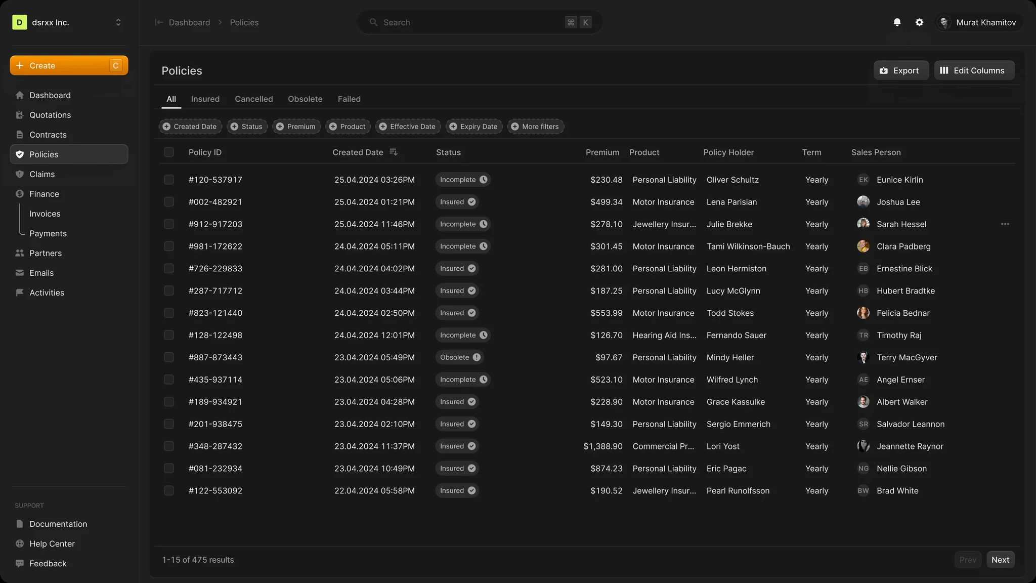
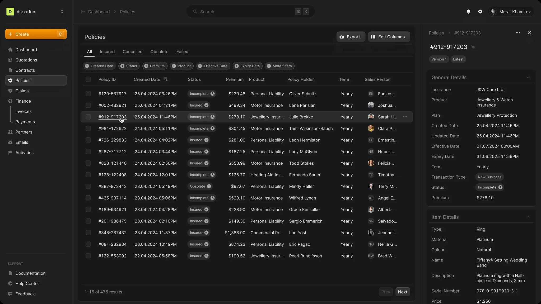
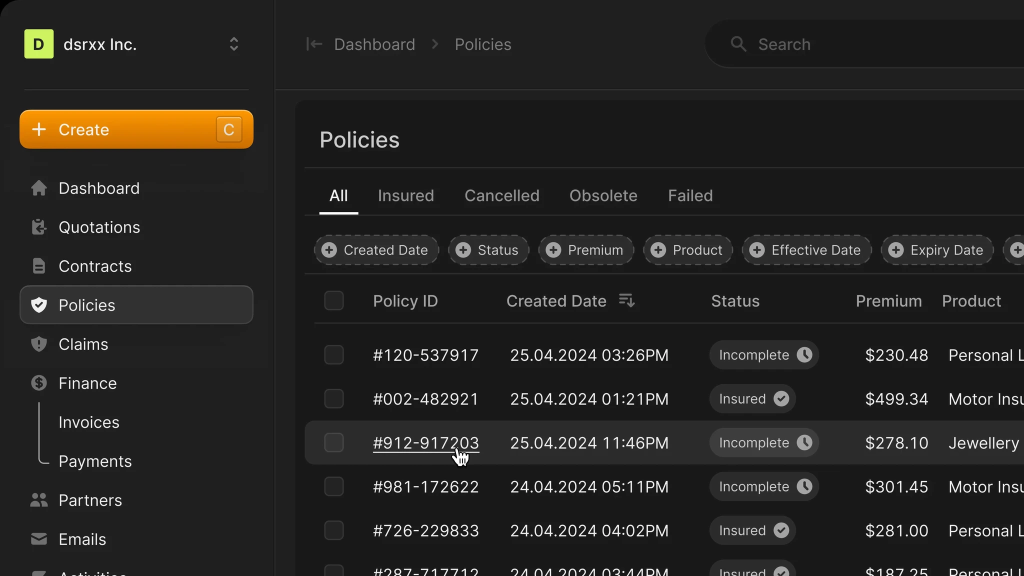
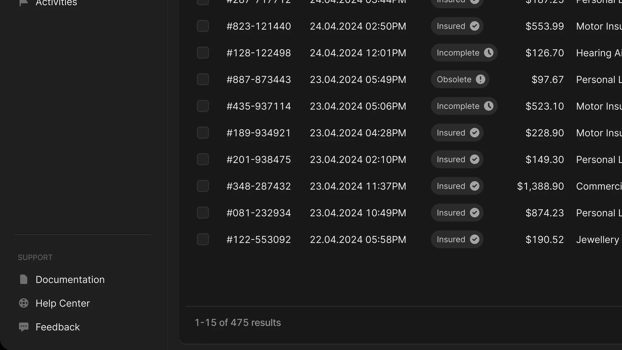
Revamped Policy Search Page: Built a brand-new user interface from the ground up.
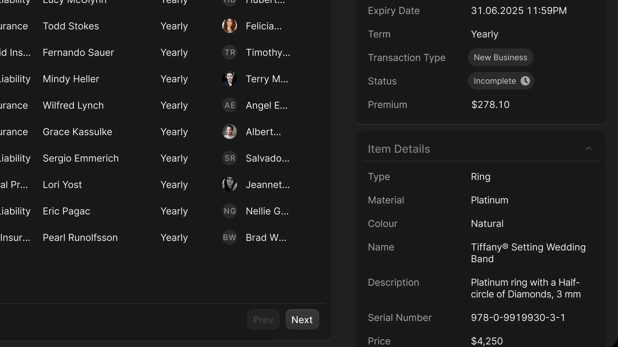
Now featuring Quick View: Users can learn more about an object without being redirected to a new page.
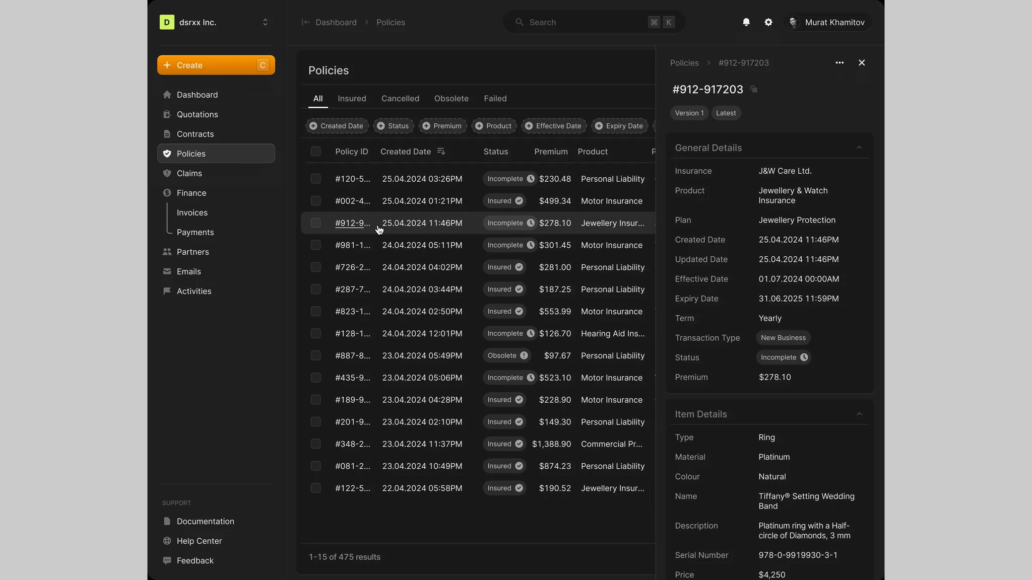
The new Quick View is responsive, adapting to breakpoints or user interactions by either pushing the table for larger screens or overlaying it for limited view areas.
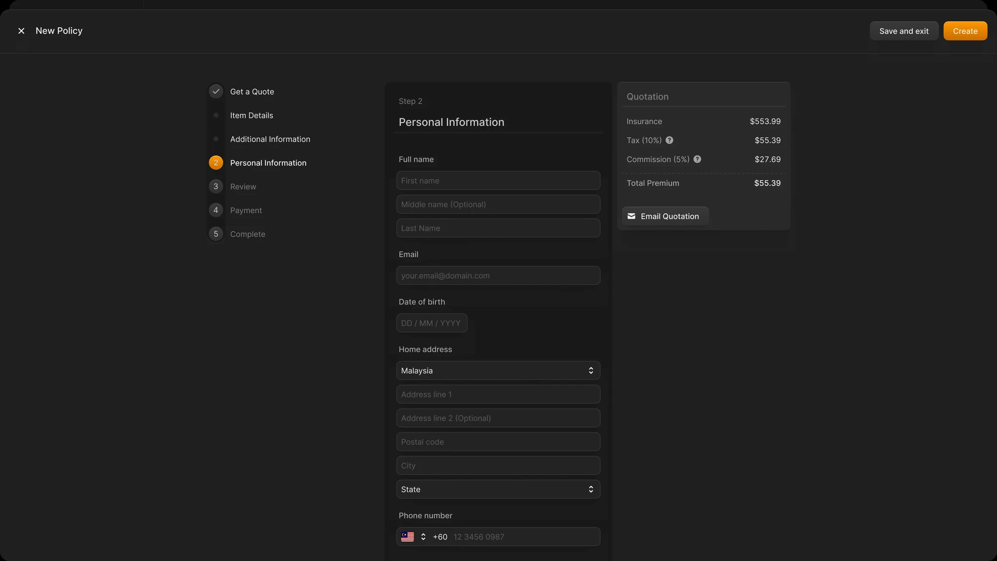
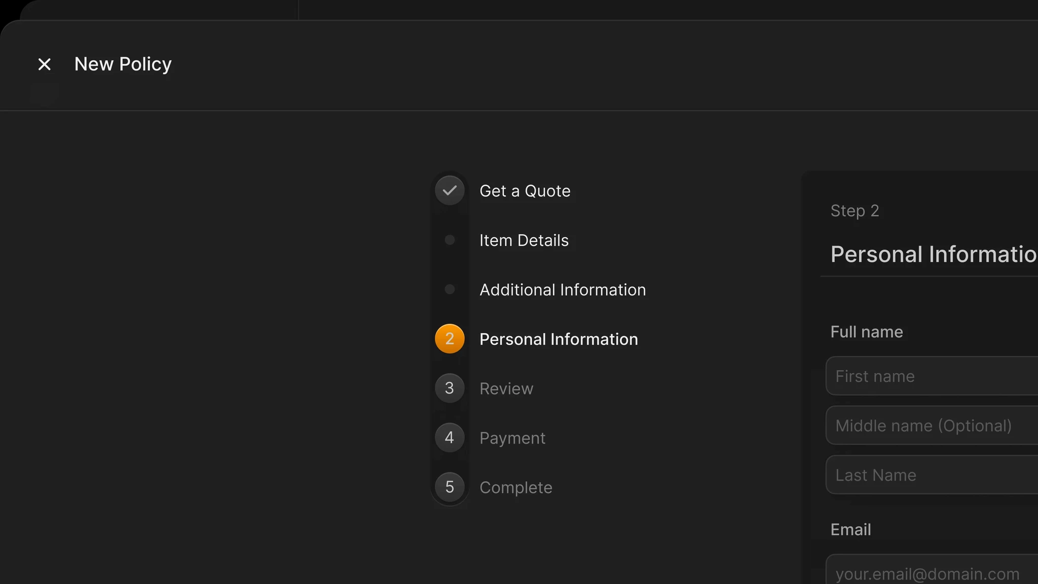
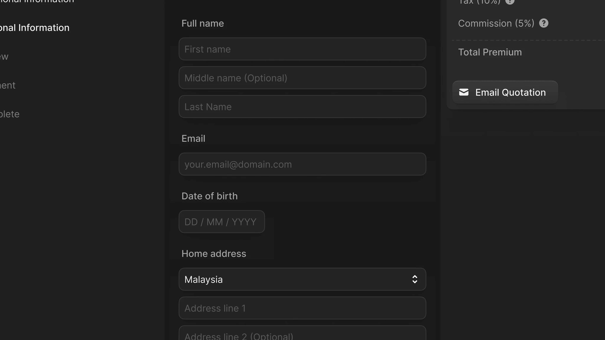
The new policy creation process features a full-screen dialog with a three-column layout, including a stepper, form, and real-time quotation card.


Result
Enhanced User Experience
Simplified design and improved navigation have made the platform more user-friendly.Increased Engagement
Addition of interactive features has boosted user interaction and exploration.Improved Accessibility
Ensuring accessibility has broadened the user base and increased satisfaction.Seamless Integration
The platform now works seamlessly across all devices, improving accessibility and satisfaction.Positive Brand Perception
Rebranding to i2goX has refreshed the platform's image, attracting more interest.
Conclusion
The redesigned platform has significantly improved user experience, engagement, accessibility, and brand perception. Continued focus on user feedback will be key to sustaining this success.